TEAS® Math Study Guide
Data Interpretation
Presenting data in the form of a table or graph makes it easier to see patterns and interpret relationships. On the test, you will be asked to make sense of data presented as tables, line graphs, bar graphs, pie charts, and scatterplots.
Tables
| Product | Monday | Wednesday | Friday |
| Bread | 120 | 130 | 160 |
| Milk | 85 | 90 | 95 |
| Eggs | 150 | 140 | 170 |
| Cheese | 60 | 75 | 80 |
Tables organize information using rows and columns. Each row usually represents a different item, while each column shows a specific category or measurement. To read a table correctly, begin by identifying the column headers. These tell you what each number means. When comparing values, follow the rows across or the columns down to see how one item measures up against another. Tables are great for spotting patterns and comparing data directly. If you’re asked a question about a table, focus on the row or column that contains the most relevant data and read the numbers carefully.
Tip: Highlight or underline the row/column relevant to the question.
Line Graphs
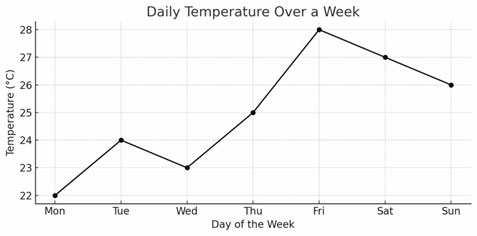
Line graphs show how something changes over time or along a continuous scale. Each point on the graph represents a value, and the points are connected by lines to show trends. The horizontal axis often represents time, like months or years, while the vertical axis shows the amount or measurement being tracked. A steep line indicates a rapid change, while a flat line shows little or no change. When analyzing a line graph, look for peaks and dips, which show high and low points, and notice whether the line is moving up, down, or staying level. Line graphs help you quickly see overall trends and whether values are increasing, decreasing, or staying consistent.
Tip: Follow the line with your finger to spot patterns.
Bar Graphs
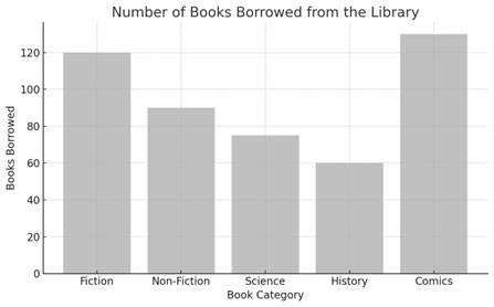
Bar graphs use bars to show how different items compare in quantity. For example, a bar graph might compare the number of books read by students in different classes. Each bar represents the category, and the height (or length) of the bar indicates the amount or number. The bars may be vertical or horizontal. To interpret a bar graph, look for the tallest bar to find the largest value and the shortest bar for the smallest. It’s also helpful to check how far apart the bars are and how they change across the graph.
Tip: Always check the scale on the side, because it may increase by twos, fives, or tens rather than ones.
Pie Charts
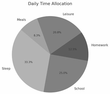
Pie charts display information as slices of a circle (which is why they are also known as circle charts). Each slice represents a part of the whole, usually shown as a percentage. The size of the slice tells you how big that part is compared to the total. Pie charts are useful when you want to see how something is divided. For instance, a pie chart might show how a family’s monthly expenses are split among rent, food, transport, and savings. When looking at a pie chart, try to identify which slice is the largest and which is the smallest.
Tip: If values aren’t labeled, estimate size using the 90° = 25% rule.
Scatterplots
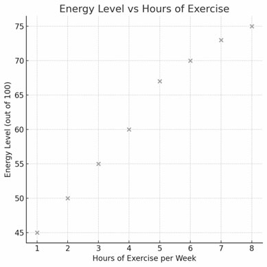
Scatterplots use dots to show how two things are related. Each dot represents a pair of values—one on the horizontal axis and one on the vertical axis. If the dots generally go upward from left to right, it means there is a positive relationship: as one value increases, the other does too. If the dots go downward, it shows a negative relationship. If the dots are scattered without any pattern, then there is likely no strong relationship. Scatterplots are especially helpful when looking for trends or trying to spot outliers (i.e., dots that don’t fit the general pattern). The closer the dots are to forming a straight line, the stronger the relationship.
Tip: If a line could be formed from the dots, a pattern likely exists.