
TEAS Reading Study Guide
Interpreting Visuals and Data
Not every "passage" on the TEAS is made of sentences. You’ll be given graphs, charts, tables, diagrams, and labels and be asked to read information from them. No science or math knowledge is required — just careful, systematic reading. This is a heavily tested skill, so it’s worth learning each common visual type.
Study the frame before the picture. Whatever the visual, look at its structure before its numbers. Read the title (what is this showing?), then the axis labels or headings (what is being measured?), then the units (inches? thousands? percentages?), and the legend or key if there is one (what do the colors or symbols mean?). Students lose easy points by diving into the data and misreading what it represents. Thirty seconds spent on the frame prevents most errors.
Bar graphs compare separate categories. Each bar’s height (or length) shows a value, and you compare bars to see which category is largest or smallest, or how two categories differ.
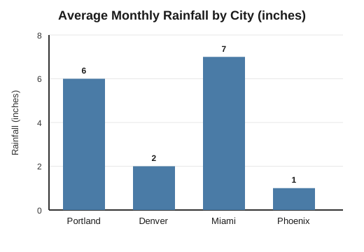
To read it: find the bar you need, trace its top across to the scale, and read the value. In the graph above, Miami’s bar reaches 7 inches — the tallest — while Phoenix’s reaches only 1. To compare two cities, subtract: Portland (6) gets 4 more inches than Denver (2).
Line graphs show how a value changes over time or across a continuous range. The line’s direction tells the story: rising, falling, or holding steady. A steep segment means rapid change; a flat one means little change.
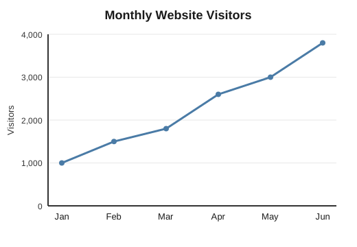
To read it: follow the line left to right. Above, visitors climb every month, so the trend is a steady increase. The steepest rise is between March and April, where the line jumps most sharply. Because the trend is consistently upward, a reasonable prediction is that July’s number would be higher still — extending the established pattern.
Pie charts show parts of a whole, always adding up to 100 percent. Each slice’s size shows its share. Use them to see which category is largest, or to combine slices.
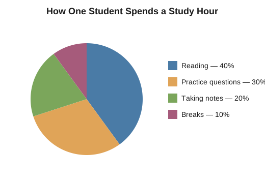
To read it: check the legend to match each color to a category and then compare slices. Above, reading is the largest single activity at 40 percent. To combine categories, add their percentages: reading and practice questions together make up 70 percent of the hour.
Tables list exact values in rows and columns. They’re precise but require you to find the right cell: read the row heading and the column heading, and then locate where they meet.
|
Group |
Average sleep per night |
Average practice test score |
|
A |
5 hours |
71% |
|
B |
6 hours |
78% |
|
C |
7 hours |
85% |
|
D |
8 hours |
88% |
To read it: to find Group C’s score, follow the "C" row across to the score column — 85 percent. Tables also reveal trends when you scan down a column: here, as sleep rises, scores rise, too.
Correlation is not causation. This is one of the biggest traps in data interpretation. When two things rise together — like sleep and test scores above — it’s tempting to say one caused the other. However, a chart of numbers alone can’t prove cause; some third factor might drive both, or the link might be a coincidence. The careful reader reports the relationship ("students who slept more tended to score higher") without leaping to cause ("sleeping more makes you smarter"). On the test, the overconfident causal answer is usually wrong, and the measured one is usually right.
Putting it in practice:
Read titles, labels, units, and legends before the data. Match the visual type to its job — bars compare, lines track change, pies show shares, and tables present exact values. Locate exactly what the question asks. When you spot a trend, describe it without assuming it proves causation, and extend it only as far as the data reasonably supports.